Introduction: The Aesthetic Conflict that Divides Design
The debate between minimalist and maximist design is not new, but it has gained renewed strength in recent years.Both approaches have their passionate advocates and successful practical applications.The truth is that there is no universal winner 'WHAT works depends on the context, audience and project objectives.
While minimalism preaches simplicity, clarity, and the elimination of the superfluous, maximalism celebrates visual richness, fearless expression, and abundance of elements.This creative tension has shaped not only graphic design, but also architecture, fashion, and digital user experience.
In this article, we will explore both philosophies in depth, analyzing their fundamental principles, real advantages, and limitations, to help you choose the right approach for your project.
What is Minimalist Design?
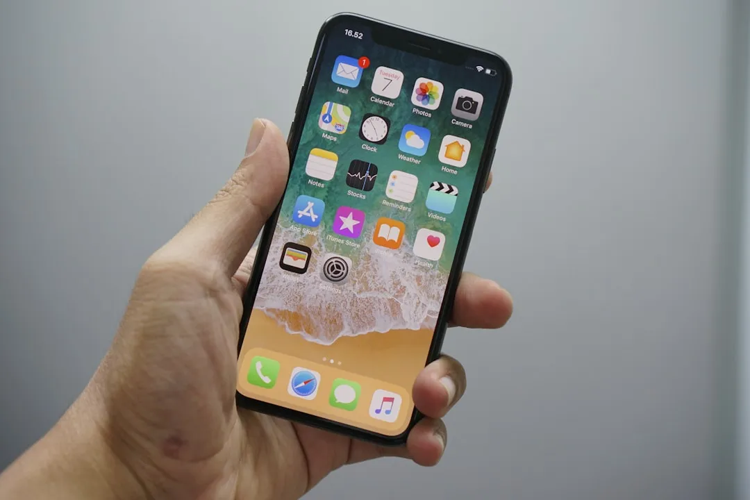
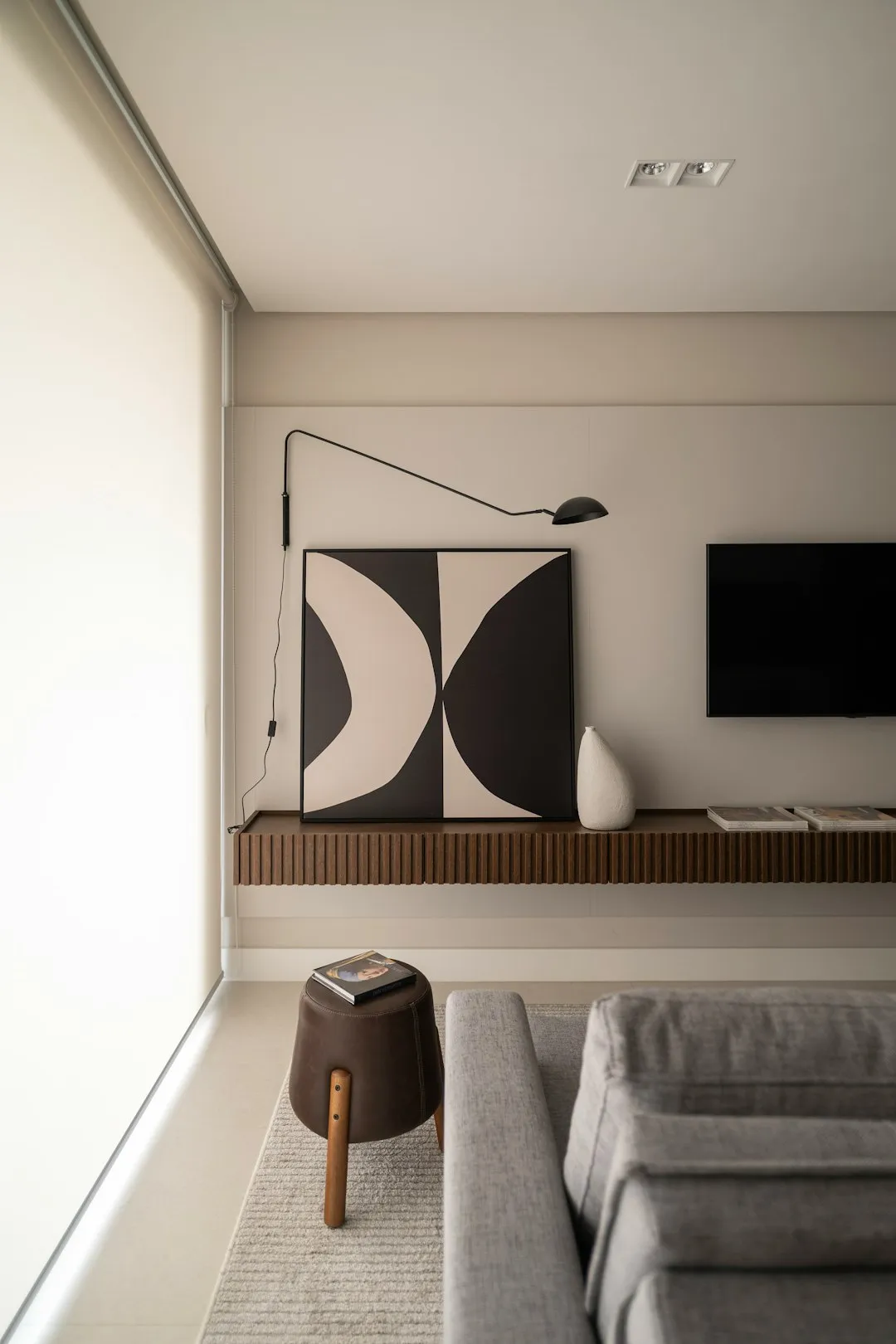
Minimalist design reduces the visual interface to the essentials. It follows the principle «less is more»: each element should serve a clear purpose. Limited colors, simple typography, plenty of white space and well-defined visual hierarchy are striking features.
Brands like Apple, Airbnb and Google have consolidated minimalism in digital design.Their interfaces are clean, straightforward and intuitive.The emphasis is on functionality: the user knows exactly where to click, what to expect and how to navigate.
Minimalism works especially well in contexts where load speed matters, where conversion rate is critical, or when you need to convey professionalism and trust.UX studies show that users convert better into simple interfaces with fewer visual distractions.
What is Maximist Design?
Maximist design is the opposite: it values visual richness, patterns, vibrant colors, textures, bold typography and multiple layers of information. Here, abundance is expression, not disorder.
Creative agencies, digital magazines, fashion brands and art platforms often embrace maximalism.Pinterest, some creative startup landing page designs, and online magazines explore this dense visual space to tell richer stories.
Maximalism communicates creativity, personality and sophistication. It is particularly effective when you want to excel in a saturated market or when your audience is younger and digitally savvy.However, it requires caution: if it is not well balanced, it can overwhelm the user and impair readability.
Advantages of Minimalist Design
Clarity and Focus: With fewer visual elements, the main message becomes crystal clear.The user does not get lost in decorations and goes straight to the point. This speeds up the time of understanding and reduces the cognitive load.
Performance and Speed: Minimalist designs tend to be lighter. Fewer images, fewer animations, less CSS result in pages loading faster - a critical factor for SEO and mobile conversion.
Accessibility: Simple interfaces are more accessible. Fewer elements mean fewer barriers for users with visual or motor disabilities. Contrast is better controlled and navigation is more predictable.
Perceived Professionalism: Minimalist design communicates order, trust and sophistication.Sectors such as finance, health and technology benefit from this perception.
Versatility: A minimalist design works well on any screen from smartwatch to big TV. Responsiveness is naturally better.
Advantages of Maximist Design
Differentiation and Memorability: In a sea of white and gray designs, maximalism jumps to the eye.Creates strong visual memories and marks emotional presence in the user.
Narrative and Context: With more space for visuals, you can tell more complex stories on a single screen. Patterns, custom icons, and illustrations create immediate context.
Brand Expression: For creative brands, fashion, art and entertainment, maximalism is authentic. It reflects the brand identity without appearing cold or distant.
Emotional Engagement: Rich designs visually stimulate emotions.Vibrant colors, textures and bold shapes create more immersive and memorable experiences.
Creative Freedom: Designers have room to experiment, break visual rules and innovate.This attracts creative talent and positions the brand as the forefront.
Which Trend Wins?The Royal Verdict
There is no absolute winner.What defines success is the context. Consider these criteria:
Type of Product or Service: SaaS and productivity tools thrive on minimalism. Media, art, fashion and entertainment embrace maximalism. E-commerce varies as the segment Luxury can use maximalism; electronics store, minimalism.
Target Audience: Older users and users in corporate environments respond best to minimalism.Public Gen Z, young creative audiences and artistic communities appreciate maximalism.
Page Objective: Want quick conversion (sales, signup, download)? Minimalism.Want immersion, exploration and storytelling?.
Cultural and Market Context: Saturated markets require more differentiation than maximalism. High-value competitive niches (B2B, financial services) need clarity.
Current Trends and Hybrids
The reality of 2024 shows an interesting convergence.Many winning designs combine the best of both worlds: a clarity and structure of minimalism with strategic maximist accents. We call this «intelligent maximalism» or «generous minimalism».
Examples: a website with a clean interface (minimalist) but with rich visual storytelling sections (maximalist). An app with minimalist navigation but with personalized icons and unique visual patterns. An e-commerce of luxury products with a lot of white space (minimalist) but with ultra-rich photographs in detail (maximist).
This hybridization recognizes that users want clarity, but also want emotion.Speed, but also connection.The winning trend is not one or the other, but the deliberate intention: every visual element exists for a reason.